Tablets are versatile, mobile, and increasingly seen as a viable alternative to laptops, especially in price-sensitive markets like India.
While tablets often outperform mediocre laptops in the same price range, the lack of an included keyboard is a drawback. Optional keyboards are costly and come with compatibility issues, making tablets less practical for some users.
Using tablets as a primary device works well—until you need to use an intensive tool like Figma.
Figma, a favorite among designers worldwide, relies heavily on shortcuts, which are integral to efficient workflows but dependent on keyboards. Without them, using Figma on a tablet becomes time-consuming and frustrating.
This case study focuses on optimizing Figma for touch-sensitive devices without keyboards, enhancing usability and efficiency.
For my research, I began by exploring Google, followed by Quora, Reddit, and YouTube. However, I found limited data on the use of Figma on tablets. To address this, I decided to experience using Figma on a tablet firsthand.
It became evident that frequently used functions were significantly harder to execute on a tablet.
Observation
Everything worked smoothly, from placing frames to creating components and auto-layout—until I made a mistake and needed to undo it.
I immediately noticed the cumbersome user flow required to perform even the simplest action, such as undoing a step.
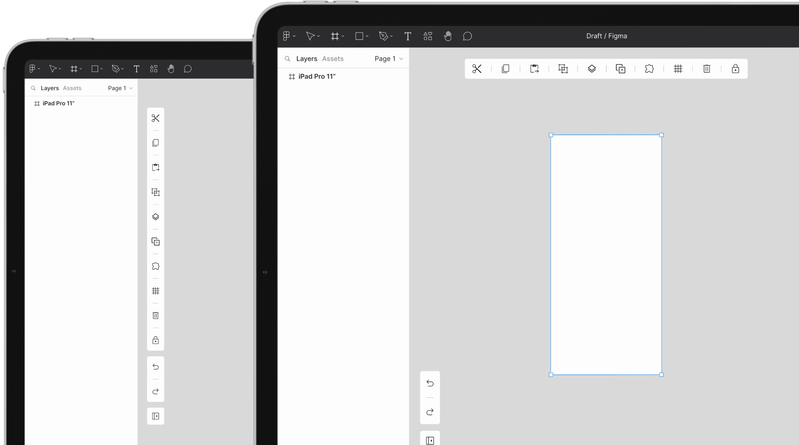
Here is the user flow required to perform basic actions like undo, redo, delete, and more.

Ironically, complex tasks like creating components and auto-layout were easy, as they are readily available on Figma's UI panel.
In contrast, simple yet frequent actions required a lengthy process, which highlighted and simplified the broader problem.
The above pinpointed the issue: the lengthy path is needed only for simple functions missing from the UI and reliant on keyboard shortcuts.
This issue relates to several usability heuristic failures. Here are the three I identified.
Usability Heuristic Failure
This issue relates to several usability heuristic failures. Here are the three I identified.

Identification
During my usage, I identified these functions to be frequently used, mainly for error correction and enhancing efficiency.

With the problem identified, my next step was to explore ideas for a solution.
I began by analyzing other tools for inspiration and gathering as many ideas as possible. After assessing their touch-device friendliness, I used a structured methodology to organize the insights and develop a concept.
SCAMPER
To structure the insights I gathered and develop a concept, I utilized the SCAMPER technique.

Conceptualization
Using the SCAMPER technique, I formulated three possible solutions. My objective is to identify the best solution that not only addresses the problem but also aligns with the three heuristic principles.

After evaluating the pros and cons of all three concepts, I decided to proceed with a combination of the 2nd and 3rd concepts.
Wireframe
I analyzed screen real estate, reachability, and context of use, deciding to make the secondary bar fixed while keeping only the primary function bar dynamic.

High-Fidelity
This solution addresses and overcomes the three usability heuristic shortcomings.

Usability Heuristic Pass
This solution addresses and overcomes the three usability heuristic shortcomings.


Function bar providing alternative to keyboard shortcuts as well as enhancing the user experience.